Kannada Font Library 2.0 — A Better Tool for Kannada Typography
Kannada Font Library 2.0 — A Better Tool for Kannada Typography
Kannada Font Library began as a simple idea: make Kannada fonts easier to discover and use. Over time, it became clear that listing fonts was not enough. What we needed was a better tool — something interactive, structured, and useful for real work.
That is where Kannada Font Library 2.0 comes in.
👉 Explore it here: kfl.arunck.com
Why 2.0?
As someone with a background in design and an M.Sc. in Graphics and Animation, and as someone deeply interested in type design — especially Indian scripts like Kannada — I constantly felt a gap.
Kannada fonts are scattered. Licensing is often unclear. Comparing fonts before using them is difficult.
Designers, printers, students, and everyday users deserve a better experience.
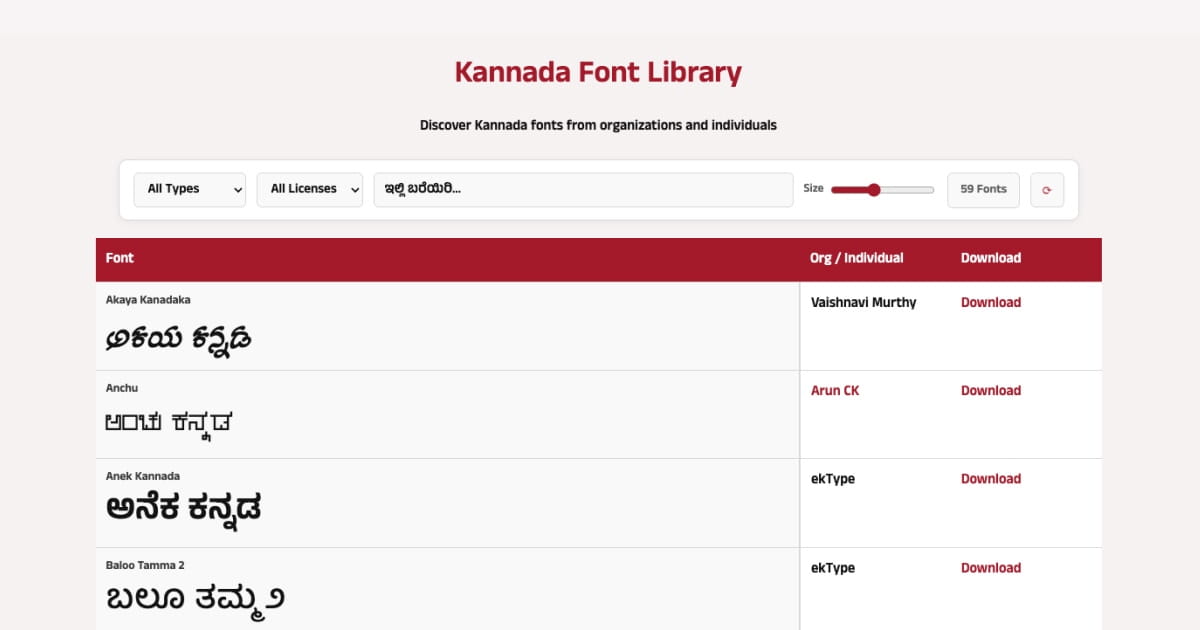
Version 2.0 transforms Kannada Font Library from a static list into an interactive tool.
What’s Improved?
Clean, Focused Interface - The platform now has a clearer structure and visual hierarchy. It’s easier to browse and compare fonts without distractions.
Live Type Testing -You can type your own Kannada text and instantly preview it across different fonts. This removes guesswork and makes font selection practical.
License-Based Filtering -Fonts can now be filtered by license type — OFL, End User, or Commercial — helping users understand usage rights before downloading.
Better Organization -Fonts from organizations and individual designers are clearly identified, making attribution and discovery easier.
A Sustainable Direction
The project now lives at: kfl.arunck.com
I chose not to continue with the previous domain. I do not want to run ads, and I prefer keeping this project simple and sustainable. Hosting it under my own domain ensures that the focus remains on utility, not monetization.
Kannada Font Library remains open-source and community-driven.
Why This Matters
Typography shapes how a language appears in the digital world. When good tools are available, better design practices follow.
By making Kannada fonts easier to explore and test:
- Designers can make informed choices
- Printers can avoid compatibility issues
- Students can learn typography more effectively
- Developers can understand licensing clearly
This is a small contribution, but a meaningful one.
An Open Invitation
This project is open.
If you are a designer, developer, student, or type enthusiast, you can explore it, suggest improvements, or contribute through GitHub.
Kannada deserves better digital tools. This is one step in that direction.
And the journey continues.